Cards
Cards are flexible containers. The first image becomes the media, the first # heading the header, trailing links the footer — everything else is body content.
Appearance: outlined
===outlined
# Outlined card
A card with the `outlined` appearance.
===
Outlined card
A card with the outlined appearance.
Appearance: filled
===filled
# Filled card
A card with the `filled` appearance.
===
Filled card
A card with the filled appearance.
Appearance: filled-outlined
===filled-outlined
# Filled-outlined card
A card with the `filled-outlined` appearance.
===
Filled-outlined card
A card with the filled-outlined appearance.
Appearance: plain
===plain
# Plain card
A card with the `plain` appearance.
===
Plain card
A card with the plain appearance.
Appearance: accent
===accent
# Accent card
A card with the `accent` appearance.
===
Accent card
A card with the accent appearance.
Horizontal orientation
Add horizontal to place the media beside the content instead of above it.
===horizontal
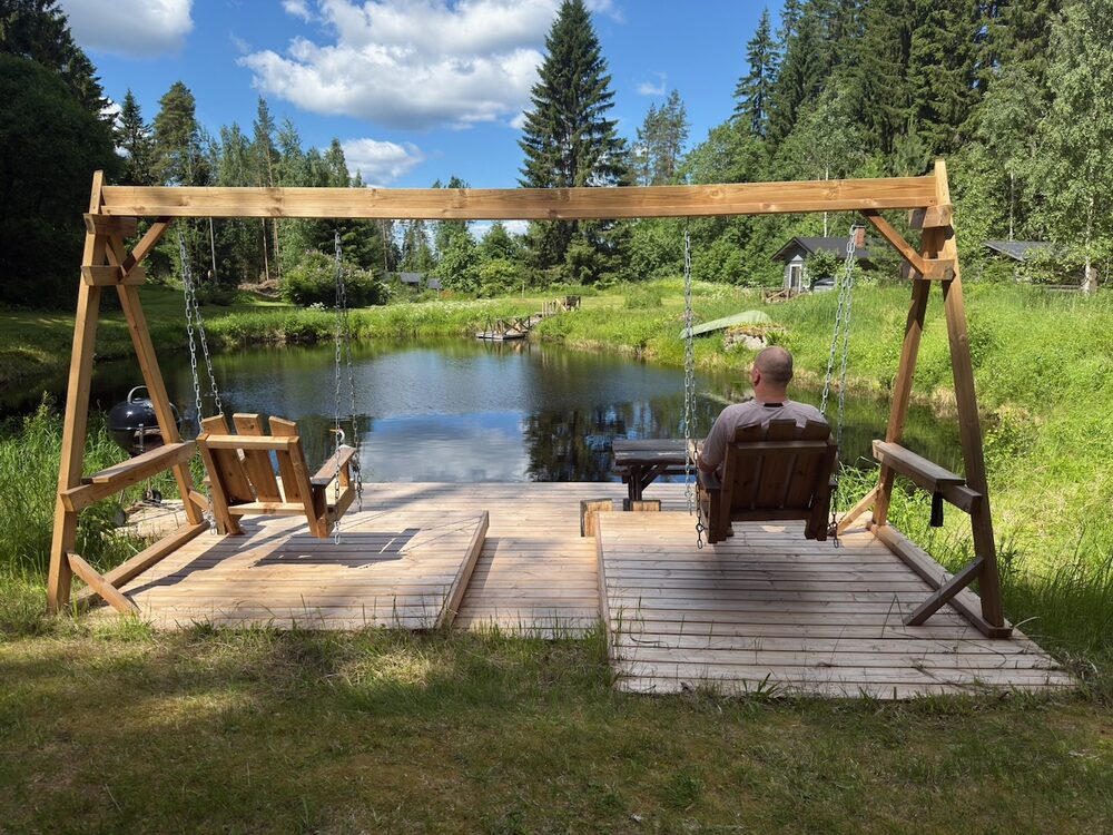
# Horizontal card
Media and content sit side-by-side.
===

Horizontal card
Media and content sit side-by-side.
Media, header, body & footer
Trailing markdown links become footer buttons.
===outlined

# Full card
A complete card with media, a heading, body copy, and footer actions.
[Learn more](https://webawesome.com) [Dismiss](#)
===
Full card
A complete card with media, a heading, body copy, and footer actions.